CSS in Four Days: The Only Roadmap You Need
frontend web development design
CSS in Four Days: The Only Roadmap You Need Learn CSS in just 4 days with a clear, beginner-friendly roadmap. Master layouts, spacing, responsiveness, and real-world CSS essentials without confusion or unnecessary theory.
This is Part 2 of the series Web Development: From Zero to Production .
If you haven’t learned HTML yet, read HTML in One Day
Most beginners don’t hate CSS because it’s hard.
They hate it because they’re learning it out of order .
CSS isn’t random.
It isn’t broken.
And it definitely isn’t “just trial and error”.
In this post, I’ll show you how to learn CSS in the right order — so layouts finally make sense instead of fighting you.
You can realistically learn CSS fundamentals in 4 focused days .
Throughout this blog, I’ll clearly tell you what to learn each day — no overwhelm, no fluff.
What CSS Actually Does
If HTML is the structure of a web page, CSS controls how that structure looks and behaves .
CSS decides:
Spacing
Colors
Fonts
Layout
Responsiveness
HTML creates elements.
CSS tells the browser how to display them .
Once you understand this relationship, CSS stops feeling random.
Day 1 — Foundations: Selectors, Box Model & Display
What Is CSS?
CSS stands for Cascading Style Sheets .
It’s the language used to style HTML elements — nothing more, nothing less.
CSS doesn’t create content.
It styles what HTML already defines.
How CSS Is Written
CSS works using property–value pairs .
selector {
  property: value;
}
What Is a Selector?
A selector tells CSS which HTML element to style .
Basic selectors you need right now:
h1 {
} /* element selector */
.heading {
} /* class selector */
#section {
} /* id selector */
Classes and IDs are added in HTML:
<h1 class="heading">This is a heading</h1>
<a id="section" href="#features">Features</a>
That’s enough selectors for now. Don’t overlearn.
How to Add CSS to HTML
There are three ways to apply CSS:
External CSS (recommended) — styles in a .css fileInternal CSS — styles inside a
Keep reading
Related articles <style>
<head>
Inline CSS — styles inside the style attribute<h1 style="color: blue;">Heading</h1>
In real projects, you’ll mostly use external CSS .
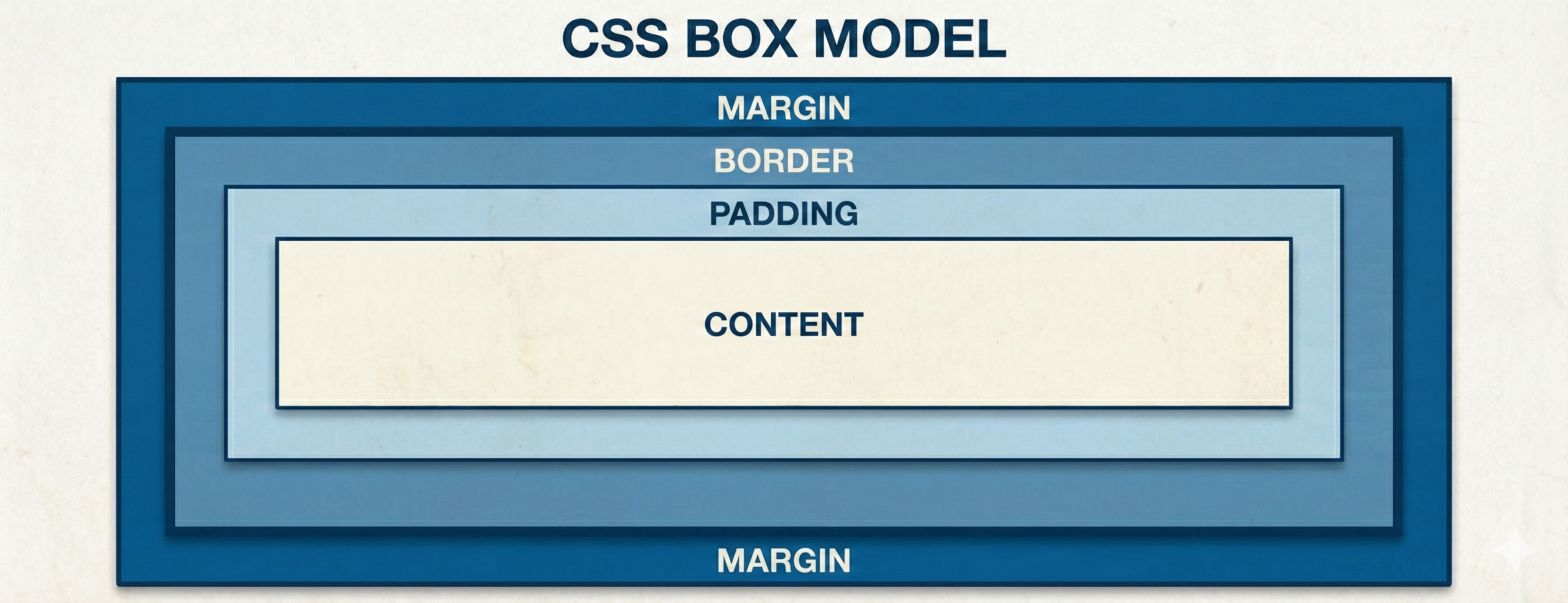
CSS Box Model (This Matters More Than You Think) Every HTML element is a box .
The box model has four parts:
Content — text or imagePadding — space inside the boxBorder — wraps padding + contentMargin — space outside the box div {
width: 300px;
padding: 15px;
border: 1px solid black;
margin: 10px;
}
By default, width and height apply only to the content .
Padding and border are added on top of that .
That’s why layouts look bigger than expected.
Fix This Once. Forever. * {
box-sizing: border-box;
}
Padding and border stay inside width & height
Layouts become predictable
You stop doing spacing math
If you write CSS without this, you’re choosing pain.
Spacing: Margin vs Padding
Padding → space inside an elementMargin → space outside an element .card {
padding: 24px;
margin-bottom: 32px;
}
Intentional spacing beats random spacing every time.
Display Property The display property controls layout behavior.
blockinlineinline-blocknone div {
display: none;
}
span {
display: block;
}
h1 {
display: inline;
}
button {
display: inline-block;
}
inline → no width/heightblock → full width, new lineinline-block → best for buttonsnone → removed from layout
Day 1 Practice (Do Not Skip) Build a simple HTML page with:
Header
Two content sections
Footer
Use padding inside sections
Use margin to separate sections
No random numbers
If spacing feels off, inspect the box model in DevTools.
Day 2 — Colors, Backgrounds & Flexbox
CSS Colors (Keep This Simple) You can define colors using:
<h1 style="background-color: blue;">Hello</h1>
<h2 style="color: red;">CSS Blog</h2>
<p style="border: 2px solid violet;">Follow me</p>
Don’t memorize colors. Google them.
CSS Backgrounds
background-colorbackground-imagebackground-repeatbackground-positionbackground (shorthand) body {
background: #fff url("image.png") no-repeat right top;
}
CSS Flexbox (Alignment, Finally Explained) Flexbox exists to solve alignment problems .
.container {
  display: flex;
}
Main Axis vs Cross Axis
flex-direction: row → main axis horizontalflex-direction: column → main axis vertical
justify-content → main axisalign-items → cross axis
justify-content (Main Axis Control)
This decides how items are distributed along the main axis .
.container {
  justify-content: value;
}
flex-start (default) - Items stick to the start of the main axiscenter - Items are centeredflex-end - Items stick to the endspace-between - First item at start, last at end, space in between (no space on edges)space-around - Equal space around each item (edges get half-space)space-evenly - Equal space everywhere (including edges)
align-items (Cross Axis Control)
This decides how items align perpendicular to the main axis .
.container {
  align-items: value;
}
stretch (default) - Items stretch to fill the container (if height/width isn’t set)flex-start - Items align to the start of the cross axiscenter - Items align to the centerflex-end - Items align to the endbaseline - Text inside items aligns by baseline (useful for mixed font sizes) Most beginners mix these up and start “fighting” flexbox.
gap (Use This Instead of Margins) .container {
display: flex;
gap: 16px;
}
flex-wrap .container {
flex-wrap: wrap;
}
Without this, items will overflow. With this layout gets space.
.container {
  display: flex;
  justify-content: center;
  align-items: center;
  gap: 20px;
  flex-wrap: wrap;
}
Day 2 Practice Tasks
Logo left, links right
justify-content: space-betweenNo fixed heights
Use padding, not height
3 cards in a row
Wrap on small screens
Use gap
Column layout
Perfect centering
No hacks
If you need hacks to center something, you don’t understand flex yet.
Day 3 — Grid & Responsive Layouts Flexbox is one-dimensional .
If you’re laying out a page structure, Grid wins.
.layout {
  display: grid;
  grid-template-columns: 250px 1fr;
  gap: 24px;
}
fr Units grid-template-columns: 1fr 2fr;
This is ratio-based layout.
Responsive Grid .grid {
display: grid;
grid-template-columns: repeat(auto-fit, minmax(250px, 1fr));
gap: 20px;
}
Mobile-First Thinking .container {
grid-template-columns: 1fr;
}
@media (min-width: 768px) {
.container {
grid-template-columns: 250px 1fr;
}
}
Mobile is the constraint. Desktop is the expansion.
Day 4 — UI Polish: Corners, Gradients, Shadows & States This is where your UI stops looking flat and starts feeling interactive .
These features are signals , not decoration.
They tell users what’s clickable , what’s active , and what’s important .
Border Radius Rounded corners softern interfaces and improve visual flow.
.card {
  border-radius: 8px;
}
Common, Safe Values
4px → inputs, small elements8px → cards (most common)12–16px → modals, sections999px → pills, badges, buttons
Gradients Gradients let you create smooth color transitions instead of flat colors.
Linear Gradient - colors transition in a straight line Gradients have 3 types & in projects, you'll use linear gradient 90% of time.
Linear Gradient Syntax background: linear-gradient(direction, color1, color2, ...);
background: linear-gradient(to bottom, red, yellow);
This creates a top → bottom color transition.
Box Shadows (Depth & Hierarchy) Shadows show elevation , not style.
.card {
  box-shadow: 0 4px 12px rgba(0, 0, 0, 0.08);
}
Soft
Low opacity
Used only where needed
If everything has a shadow, nothing stands out.
Pseudo-Classes Pseudo-classes describe states — not elements.
You’ll use these everywhere in real projects.
:hover — Interaction Feedback, used when users point at something clickable.:active — Pressed State, shows when an element is being clicked.:focus — Keyboard & Accessibility (Don’t Skip):disabled — Non-Interactive State:first-child / :last-child (Layout Cleanup) .button:hover {
}
.button:active {
}
.input:focus {
}
.button:disabled {
}
.list-item:first-child {
}
Never remove focus styles without replacing them.
Transitions Transitions make state changes feel natural.
.button {
  transition:
    background-color 0.2s ease,
    transform 0.2s ease;
}
Best properties to transition:
colorbackground-colorbox-shadowtransform Avoid animating layout properties.
Simple Animation (Use Sparingly) @keyframes fadeIn {
from {
opacity: 0;
transform: translateY(10px);
}
to {
opacity: 1;
transform: translateY(0);
}
}
.section {
  animation: fadeIn0.4s ease-out;
}
Day 4 Practice
Interactive cards
Button states
Focus styles on inputs
Avoid Over-Specific Selectors The more specific your selector, the harder it is to override later.
Avoid chaining selectors unless necessary.
Debugging Like a Developer
Inspect element
Check box model
Check display
Check parent layout
Don’t add new CSS blindly
Real-World CSS Principles
Let HTML structure do the heavy lifting
Style fewer things, not more
Reuse classes
Don’t chase pixel perfection early
Consistency beats creativity
Common CSS Mistakes Beginners Make
Chaining selectors unnecessarily
Using fixed widths everywhere
Ignoring mobile layouts
Copy-pasting CSS without understanding
Adding CSS to “fix” CSS
And the most important truth:
If you don’t understand why a style works, you don’t own it.
Final Advice Learn it in order , practice intentionally, and stop guessing.
Next up: JavaScript — where static pages start behaving like real applications.
Break things. Inspect everything. And never write CSS you can’t explain.